Buffalo Presbyterian Church
Church Logo Design + Branding
Buffalo Presbyterian Church is a historic church in Greensboro, North Carolina, founded in 1756 and rooted in more than two and a half centuries of faith and community. As the church looked toward the future, they wanted to refresh their visual identity to better communicate the strength, warmth, and faith at the heart of their congregation.
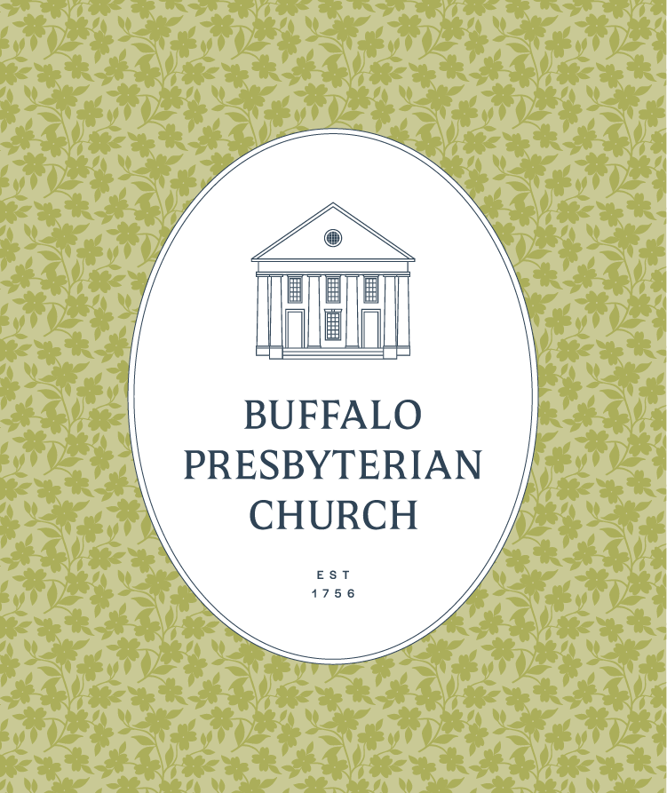
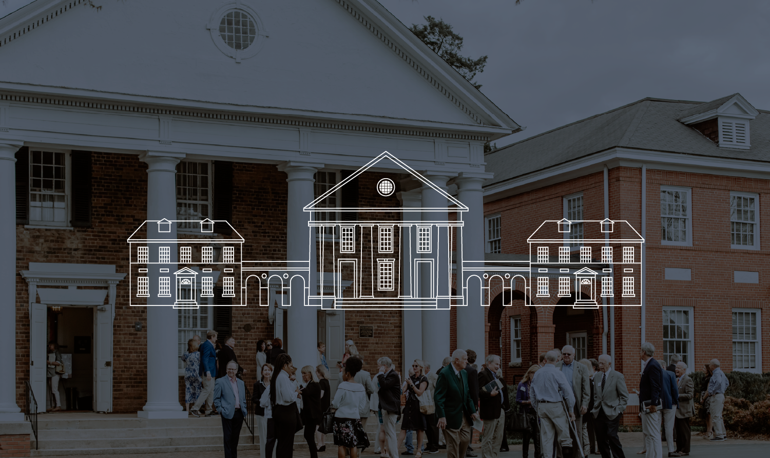
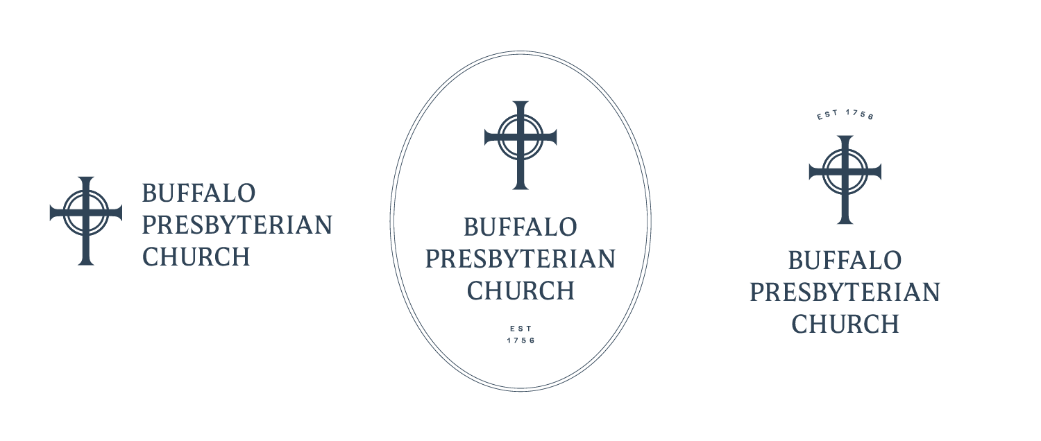
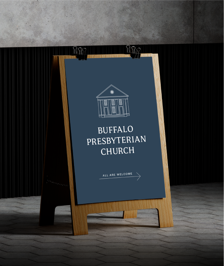
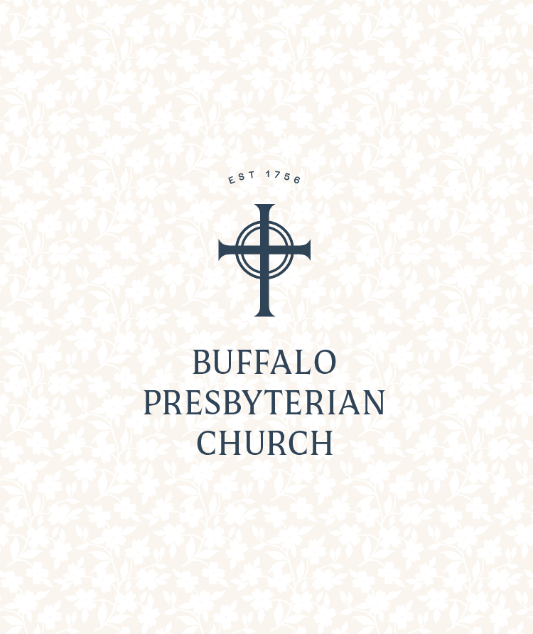
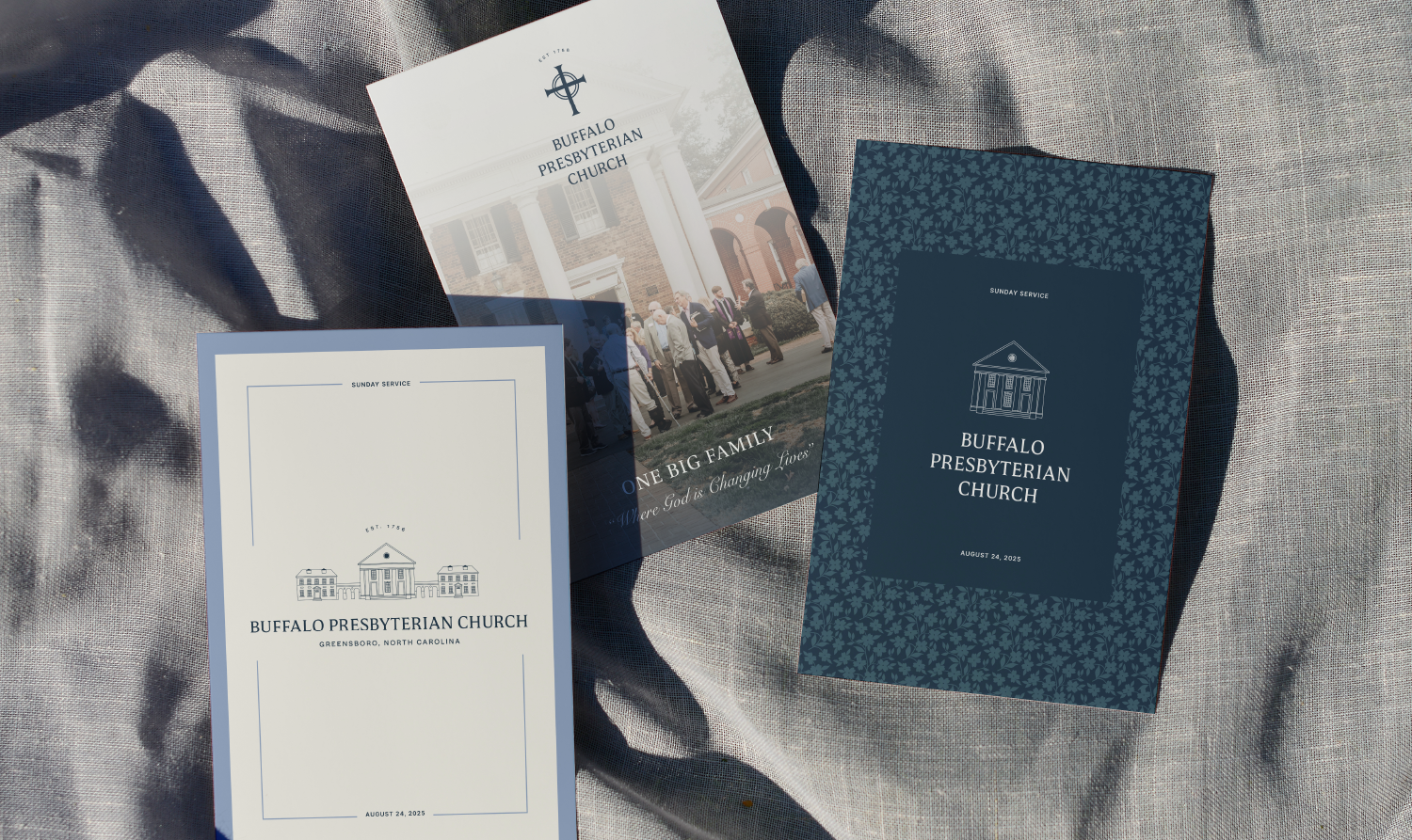
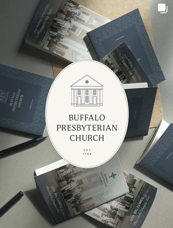
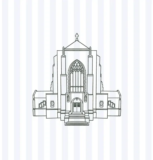
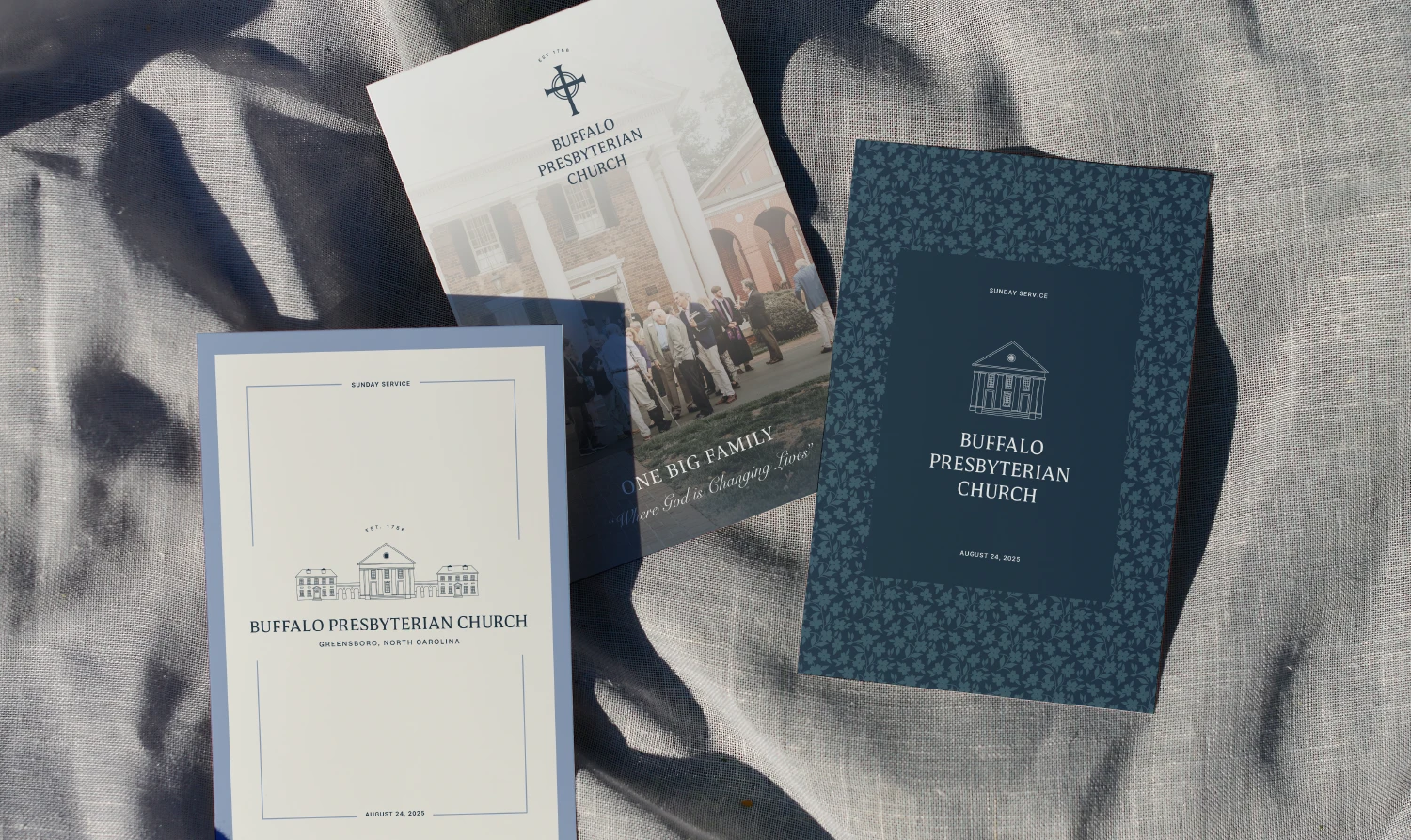
We developed a flexible logo system, typography, color palette, and custom brand patterns. The new identity draws from the church's historic architecture while incorporating meaningful Christian symbolism and elements inspired by the North Carolina landscape.
The primary logo features the church building, while alternate marks incorporate a bespoke cross designed to emphasize the central role of Jesus in the congregation's faith. Custom dogwood-inspired patterns—referencing North Carolina's state flower and its symbolism of rebirth, resurrection, and hope—add another layer of meaning to the visual identity.
The resulting brand identity honors Buffalo Presbyterian's rich history while giving the congregation a modern, cohesive visual system for communicating its mission and connecting with its community.